Recently, there has been a series of discussions about Tailwind CSS on the Front-End Developers Taiwan Facebook group. The reason for this is another post that has been deleted. I have seen that post, but I won’t talk about what it was about because it’s not the focus of this article.
Anyway, that post sparked a lively discussion among front-end communities on Facebook, and many articles related to technology were quickly added within two or three days.
And many people are actually discussing the concept of Atomic CSS more than the tool Tailwind CSS.
The term Atomic CSS was coined by Thierry Koblentz and first appeared in this must-read classic published in 2013: Challenging CSS Best Practices.
So what is Atomic CSS? Here’s the definition given by Let’s Define Exactly What Atomic CSS is:
Atomic CSS is the approach to CSS architecture that favors small, single-purpose classes with names based on visual function.
For example, something like this is Atomic CSS:
.bg-blue {background-color: #357edd; }
.margin-0 { margin: 0; }
And Tailwind CSS is a CSS framework that implements the concept of Atomic CSS.
In 2019, I also wrote an article about Atomic CSS, but I used another synonym called Functional CSS: Functional CSS Experience Sharing: A Blessing or a Curse?. I have already mentioned some of the things I want to talk about in that article, but I think it’s not complete enough, so I wrote another one.
In this article, I hope to read these classic articles with you because you will find that some of the points of contention may have been raised, discussed, or even resolved eight or nine years ago. Then we can see what the difference is between the earliest Atomic CSS and the current Tailwind CSS, and what are the advantages and disadvantages?
The outline is as follows:
- The Birth Background of Atomic CSS
- What problem does Atomic CSS want to solve?
- Problems and Refutations of Atomic CSS
- My View on Atomic CSS
- What has Tailwind CSS Improved?
- Conclusion
The Birth Background of Atomic CSS
As mentioned at the beginning, the term Atomic CSS was coined by Thierry Koblentz, a Yahoo! engineer, in Challenging CSS Best Practices in 2013.
Before reading this article, we can take a look at this interview in February 2022: The Making of Atomic CSS: An Interview With Thierry Koblentz, which mentions more about the background of Atomic CSS and its early application within Yahoo!.
According to the article, one day his supervisor asked him if there was a way to change the front-end style without changing the stylesheet because he wanted to avoid breaking things.
So TK made a “utility-sheet” that allowed engineers to change the front-end style without changing the stylesheet. It sounds like this utility-sheet is a static CSS file with various utility classes.
Years later, a project manager asked if they could “use utility classes for everything” to rewrite Yahoo!’s homepage, which was pioneering at the time.
Finally, they wrote a pure static CSS called Stencil to accomplish this (this will be contrasted with something that will appear later), and discovered many benefits of using it this way.
One of the features of this pure static CSS is that it can force compliance with some design styles, such as only writing classes like margin-left-1, margin-left-2, margin-left-3, etc., and each corresponding to x4, so your margin can only be 4px, 8px, and 12px, which are multiples of 4, using this to force design to follow existing rules.
However, they later found that this system did not work. In the real world, each design team has its own different requirements, and they all want different padding, margin, font, and color, so static is not possible, customization is needed, and dynamic generation is needed.
Thus, Atomizer was born, a tool that generates corresponding CSS files for you.
For example, if you have a page that says:
<div class="D(b) Va(t) Fz(20px)">Hello World!</div>Atomizer will automatically generate the following CSS for you:
.D(b) {
    display: block;
}
.Va(t) {
    vertical-align: top;
}
.Fz(20px) {
    font-size: 20px;
}
This way, engineers can have greater flexibility to meet design requirements.
The syntax seen above is called ACSS, which is basically similar in functionality to the current Tailwind CSS, but uses different syntax. The naming convention of this ACSS system is inspired by Emmet, a package that allows you to quickly build HTML using syntax, and the () in the class name is inspired by function calls.
TK then talked about the differences between writing CSS in a large enterprise like Yahoo! and elsewhere. You face extremely complex situations, including cross-national and cross-timezone communication, distributed team members, hundreds of shared components, l10n and i18n, a lot of legacy code, and a lot of office politics.
In the case of maintaining a super complex project, he began to reflect on whether some common practices really bring benefits, and found that some concepts are not only not beneficial, but even harmful.
In a complex project, there are many situations that you may not have thought of, so maintenance becomes very difficult, and you must be careful to avoid some pitfalls.
In addition, the journey of promoting ACSS internally did not start smoothly. It seems that many teams were hesitant about such syntax (I guess, as I wrote in a previous article, at first glance, it looks like some kind of evil way), but the benefits of ACSS are reflected in the data. Projects that adopt ACSS have reduced the size of CSS and HTML by about 36%, so many projects still use ACSS.
If you copy the HTML of page A and paste it into page B, you will find that the UI has not changed at all. After using ACSS, there will be no different styles on other pages, which is the benefit of ACSS. The original text is written as follows:
This is because ACSS makes these components page agnostic.
“Page agnostic” is an important property that I will mention later.
The original interview also mentioned more background stories and challenges, but I will not continue to mention them here. Arvin, a good partner of TechBridge, used to work at Yahoo! and wrote ACSS internally. In 2017, he wrote an article that is also worth reading: Shallow Talk on CSS Methodology and Atomic CSS.
In fact, this interview did not focus on the problems that Atomic CSS wants to solve, but from it, we can see that TK needs to maintain large projects at work, so he naturally encounters many pain points. It is not difficult to imagine that the background of the birth of Atomic CSS is also related to this.
To find out what problems Atomic CSS wants to solve, let’s take a look at the classic work.
At the beginning of the article’s quick summary, there is a paragraph that says:
When it comes to CSS, I believe that the sacred principle of “separation of concerns” (SoC) has lead us to accept bloat, obsolescence, redundancy, poor caching and more. Now, I’m convinced that the only way to improve how we author style sheets is by moving away from this principle.
Everyone knows that when writing web pages, we should pay attention to separation of concerns, allowing HTML to focus on its content and CSS to focus on style, linking the two through class names. However, the author found that this concept actually brings many negative effects. Therefore, this article is to persuade everyone not to regard this practice as a creed. If there is a better way, why stick to it?
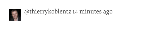
Then the article gives a simple example called a media object. The HTML looks like this:
<div class="media">
  <a href="https://twitter.com/thierrykoblentz" class="img">
        <img src="thierry.jpg" alt="me" width="40" />
  </a>
  <div class="bd">
    @thierrykoblentz 14 minutes ago
  </div>
</div>
The CSS looks like this:
media {
    margin: 10px;
}
.media,
.bd {
    overflow: hidden;
    _overflow: visible;
    zoom: 1;
}
.media .img {
    float: left;
    margin-right: 10px;
}
.media .img img {
    display: block;
}
The final result is shown below:
Then the first requirement comes up. In some places, the image needs to be displayed on the right instead of the left. So we can add a new class imgExt to the HTML element and add the following CSS:
.media .imgExt {
    float: right;
    margin-left: 10px;
}
Then the second requirement comes up. When this block of content appears in a right rail, the text needs to be smaller. So we can wrap a div around it like this:
<div id="rightRail">
    <div class="media">
        <a href="https://twitter.com/thierrykoblentz" class="img">
            <img src="thierry.jpg" alt="me" width="40" />
        </a>
        <div class="bd">
            @thierrykoblentz 14 minutes ago
        </div>
    </div>
</div>
Then adjust the style for #rightRail. The adjusted style is as follows:
media {
    margin: 10px;
}
.media,
.bd {
    overflow: hidden;
    _overflow: visible;
    zoom: 1;
}
.media .img {
    float: left;
    margin-right: 10px;
}
.media .img img {
    display: block;
}

.media .imgExt {
    float: right;
    margin-left: 10px;
}

#rightRail .bd {
    font-size: smaller;
}
These methods of adjusting styles should be quite intuitive, but the author points out that there are actually several problems:
- Every time the UI needs to support a different style, a new CSS rule must be added.
.mediaand.bgshare the same style. If there are other things to share, the CSS selector will become larger and larger.- Four of the six CSS selectors are context-based, which is difficult to maintain and reuse.
- RTL (Right To Left) and LTR (Left To Right) will become very complicated.
At first glance, the first point seems normal. If you want to support different styles in different situations, don’t you have to write new CSS rules? But the author says there is a better way to handle it without adding new rules.
The second point seems normal too. Isn’t it common to write .media, .bg to share styles? Isn’t it inevitable if the file is large?
For the third point, context is a very important concept. For example, our media object will have different styles based on context (whether it is under #rightRail), so different CSS rules are written to handle it.
Once your CSS rules are related to context, maintenance becomes difficult in large projects.
For example, if someone accidentally changes the rightRail id to blockRightRail, your style will break. You may question, “Isn’t this his fault? If he wants to change it, he should make sure that other places won’t break.” Anyone who has made changes knows how difficult it is to make sure that other places won’t break, especially in large projects. It is very likely that when you change A, you don’t expect B to break because you don’t know they are related.
Or if another team wants to use your media object, they will copy and paste the CSS along with it to their project, but they find that their id is not rightRails, so they have to modify the style.
The fourth point is something that only large companies like Yahoo! can do (at least I haven’t done it). When doing l10n, there are many details to consider, such as some countries’ reading direction is left-to-right, and some are right-to-left.
If you want to change the direction of the above case, you need to add these two rules:
.rtl .media .img {
    margin-right: auto; /* reset */
    float: right;
    margin-left: 10px;
}
.rtl .media .imgExt {
    margin-left: auto; /* reset */
    float: left;
    margin-right: 10px;
}
Then the author introduces the concept of Atomic CSS and uses it to rewrite the example. The benefits of this approach and the HTML and CSS are shown below:
<div class="Bfc M-10">
    <a href="https://twitter.com/thierrykoblentz" class="Fl-start Mend-10">
        <img src="thierry.jpg" alt="me" width="40" />
    </a>
    <div class="Bfc Fz-s">
        @thierrykoblentz 14 minutes ago
    </div>
</div>
.Bfc {
overflow: hidden;
zoom: 1;
}
.M-10 {
margin: 10px;
}
.Fl-start {
float: left;
}
.Mend-10 {
margin-right: 10px;
}
.Fz-s {
font-size: smaller;
}Regarding the first point, do you remember the new requirement we had at the beginning? Now we don’t need to add a new CSS rule, we just need to add class="Fl-sart Mend-10" to the HTML to change the UI style, but without adding any new rules.
For the second point, now all elements that need overflow:hidden and zoom:1 can be handled with just one class name called .Bfc, no matter how many elements need it, I only have one CSS selector.
For the third point, the class name is now unrelated to the context, so the problem I mentioned earlier will not occur. Today, if I want to change the style, I can safely delete the class name because I know that nothing else will break. This is what the first paragraph of the article refers to as “page agnostic”. Class names that are unrelated to the context can be easily modified and moved around while still ensuring the same style.
In other words, it solves the problem of scope, as stated in the original text:
I believe that this approach is a game-changer because it narrows the scope dramatically. We are styling not in the global scope (the style sheet), but at the module and block level. We can change the style of a module without worrying about breaking something else on the page.
Finally, regarding the direction issue mentioned in the fourth point, it has already been abstracted through the class name. If you want to change the direction, you just need to change the CSS to this:
.Fl-start {
    float: right;
}
.Mend-10 {
    margin-left: 10px;
}
By rewriting it as Atomic CSS, we have successfully solved several problems that traditional CSS writing methods encounter, and it has the following advantages:
- The size of the CSS file grows linearly, and repeated rules use the same class name, so the file size is greatly reduced.
- It can easily support RTL and LTR.
- The class name becomes unrelated to the context, and the scope becomes smaller, making it easier to maintain and modify.
I believe that the most important of these is the third point, which is also why I support Atomic CSS.
When changing styles, you can simply delete the class name without worrying about affecting other elements. This is such a beautiful thing, and you no longer have to worry about breaking something else when changing A because the class name is unrelated to the context.
The author of Tailwind CSS has written an article before, which has more emphasis and examples on how Atomic CSS solves the problems of traditional CSS. If the above reasons are not convincing enough, you can read this article: CSS Utility Classes and “Separation of Concerns”.
In short, TK also anticipated that although this approach can solve problems, readers will definitely have a lot of doubts, so he is ready to refute them one by one.
Issues and Refutations Regarding Atomic CSS
In addition to the article, I may also refer to these three sources for the following issues and refutations:
- ACSS FAQ
- HTML5DevConf: Renato Iwashima, “Atomic Cascading Style Sheets”
- Thierry Koblentz’s presentation at FED London 2015
1. Your class name has no semantics, this is not allowed, the specification is not written like this
Regarding the semantic issue, this was also discussed in an article in 2012: About HTML semantics and front-end architecture, and there is indeed a paragraph in the HTML spec that states:
There are no additional restrictions on the tokens authors can use in the class attribute, but authors are encouraged to use values that describe the nature of the content, rather than values that describe the desired presentation of the content.
If the element is an image, then the class name should be image, not something like display-block width-[150px] margin-3 that describes its style.
The article mentioned above also pointed out that such naming strategies can become a hindrance when maintaining large projects. We don’t have to follow this, because:
- The semantics related to content can be seen in HTML.
- Except for a standard called Microformats, class names have little meaning for machines and ordinary visitors.
- We use class names only because we want to combine them with JS or CSS. If a website doesn’t need style or JS, it won’t take class names, right? Does this make your website less semantic?
- For developers, class names should contain more useful information.
Then he gave an example:
<div class="news">
  <h2>News</h2>
  [news content]
</div>
You can tell from the content that this block is for presenting news, and there is no need for a class name.
This reminds me of the development of JSX, which also directly broke the best practice that JavaScript and HTML should be separated.
If everyone is obsessed with the rules set by their predecessors, and follows them like a creed without reflecting on the reasons for their existence, there will be no so many innovative things.
As mentioned in the article Challenging CSS Best Practices:
Tools, not rules. We all need to be open to new learnings, new approaches, new best practices and we need to be able to share them.
2. Your class name is too difficult to understand, and the readability is poor.
Take a slide from the FED London 2015 presentation. They said that the syntax of ACSS is based on Emmet, and the readability is not bad:
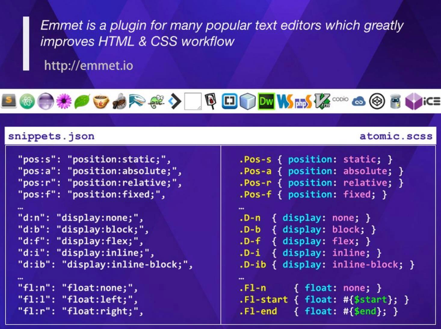
But I don’t fully agree with this explanation, because for someone who hasn’t used Emmet before, it really doesn’t look easy to understand, and it takes some time to get familiar with those abbreviations.
3. What’s the difference between this and inline style?
In essence, they are the same, both limiting the style to a very small scope, but Atomic CSS solves some of the drawbacks of inline style:
- CSS has a high priority and is difficult to override.
- It is very verbose.
- It does not support pseudo-classes or pseudo-elements.
Here is a picture from the official website:
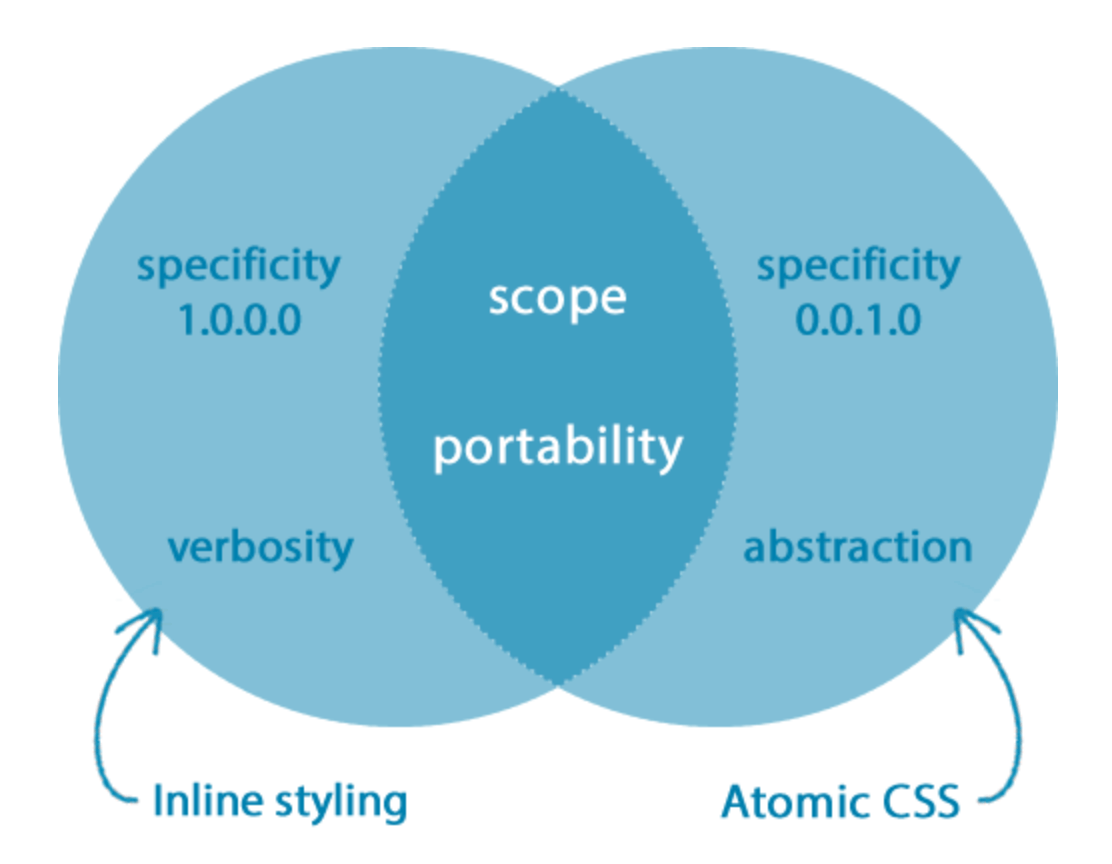
Atomic CSS retains the advantages of inline style, that is, the scope is very small, while also solving the above-mentioned drawbacks.
4. You said it can reduce the size of CSS, but won’t the size of HTML increase? It’s just shifting the cost to somewhere else.
Under the original ACSS writing method, the length of the class name is not much longer than before.
For example, it used to be called profile__image-background, and after rewriting, it might be something like D-ib Bgc(#ff0010). According to their own statistics, the average length of class names on Yahoo! website is 22, while the average length of Twitter without using ACSS is 28, USA Today is 38, The Guardian website is 36, and only Facebook, which has specially uglified class names, is 18, slightly winning.
Moreover, in addition to the class name not being significantly longer, ACSS also has the advantage of having many duplicate characters, so the compression rate of gzip will be higher. The official website has given a data that after their own testing, semantic classes can reduce the size by 35%, while ACSS can reduce it by 48%.
In the article “Challenging CSS Best Practices,” there is a paragraph discussing the idea of reevaluating the benefits of the common approach rather than adopting it as the de facto technique for styling web pages. Atomic CSS does not aim to completely replace the traditional semantic approach, and the correct approach is to use whichever is suitable.
The FAQ on the official website also mentions a similar idea: if changing some styling requires editing multiple files, then the classic CSS approach should be used.
For example, if a button in your program repeatedly appears, copying and pasting HTML each time and changing the class name in each file is clearly unreasonable. In this situation, using the traditional approach would be better.
In my opinion, Atomic CSS brings two unique benefits: reducing the size of CSS files and minimizing scope to make maintenance easier. The former is obvious, and the latter ensures that changing the class name of an element only affects that element, not other parts of the code. This is the biggest advantage of Atomic CSS, making style local scope.
However, Atomic CSS has some disadvantages and is not suitable for use in certain situations. For example, class names are long and difficult to read in HTML, and if it is impossible to achieve componentization, Atomic CSS is not suitable. Additionally, it takes time to learn the syntax and abbreviations of Atomic CSS.
The popularity of the three major frameworks has led to most front-end developers thinking in terms of components rather than the traditional approach of HTML managing content, JavaScript managing programs, and CSS managing styles. After componentization, the first two problems are solved, as developers look at component files instead of HTML and can understand what they do based on their names. Additionally, because everything is a component, changes only need to be made in one place.
Finally, CSS-in-JS and CSS modules both solve the scope problem, but they require the use of front-end libraries or frameworks like React or Vue, while Atomic CSS does not. Additionally, CSS-in-JS and CSS modules cannot achieve the same small CSS file size as Atomic CSS. However, Facebook’s Atomic CSS-in-JS solution combines the advantages of both approaches, allowing developers to write in traditional CSS syntax while generating code in the Atomic CSS way.
What parts did Tailwind CSS improve?
After discussing so much about Atomic CSS, let’s take a brief look at Tailwind CSS. What are its advantages compared to Atomizer, which was created by Yahoo! at the beginning?
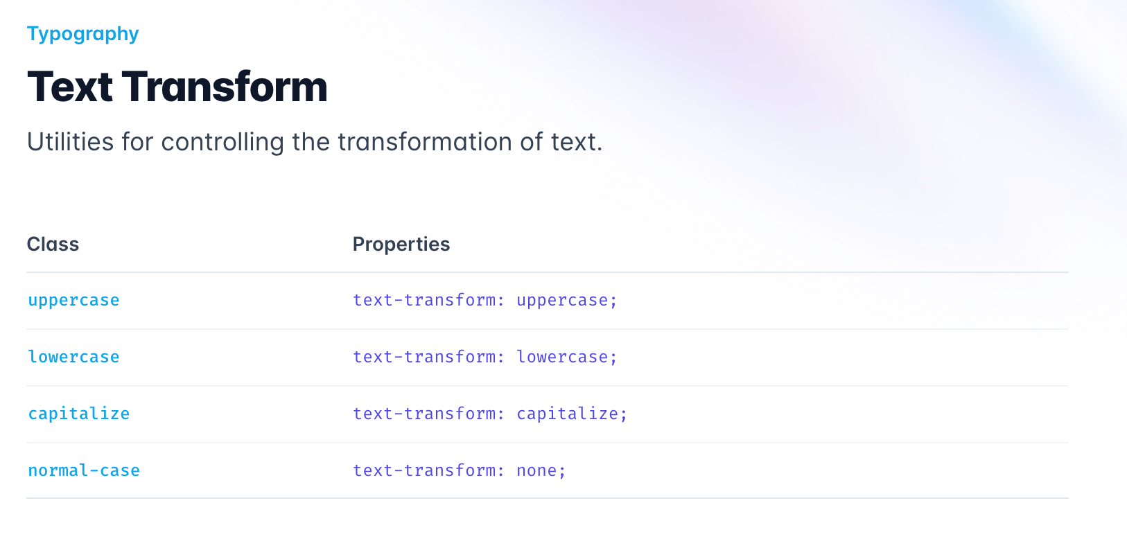
Actually, I don’t think there is much difference in terms of functionality. The biggest advantage is that I think its DX (Developer Experience) is more prominent. For example, it uses class names that are easier to understand, and the documentation is more complete. You can quickly find out how to write a certain syntax:
In fact, I think the direction of optimization for these Atomic CSS-based frameworks is similar, which is to improve the DX direction.
For example, Windi CSS brings many improvements and new usage in syntax, while UnoCSS and master CSS also have their own different methods to increase the developer’s experience or speed up compilation efficiency.
As for the details of these optimizations, I am not familiar with them. For more information, please refer to the article “Reimagining Atomic CSS” (https://antfu.me/posts/reimagine-atomic-css-zh).
I am not very familiar with Tailwind CSS either. Here is a point to note: Tailwind CSS scans your source code string to see which ones match a specific format. Therefore, if your class name is dynamically generated, it will not be captured, like this:
// wrong
<div class="text-{{ error ? 'red' : 'green' }}-600"></div>

// correct
<div class="{{ error ? 'text-red-600' : 'text-green-600' }}"></div>
I’m not sure if other libraries have solved this problem, but I personally don’t think it’s a big deal because it’s better to avoid this dynamic generation method if possible.
Why do I say that?
Let me share a story. When I was maintaining a project using Redux, there were a series of operations that were very similar, such as CRUD for post, user, and restaurant. A large part of the code was duplicated, so I wrote a utils to handle common logic. Just write generateActions('user'), and it will automatically generate actions like readUser and createUser.
At that time, I thought it was great, but my colleague reminded me that if you do this, you won’t be able to search for readUser globally because it is dynamically generated in the program and cannot be found in the source code.
Although I didn’t think it was a big deal at the time, I knew I was wrong two months later. When you face an unfamiliar project and want to fix a bug, the most common thing to do is to search the source code with the information you have on hand to see where it appears. If you can’t find anything, it’s frustrating and you need to spend more time finding where the problem is. Therefore, being searchable is important.
Or take another example. Suppose the designer suddenly changes his mind and says that all the places where text-red-600 was used before should be changed to text-red-500, but the new places will still use text-red-600, so we cannot directly change the color code in the configuration file. We must go to the source code and change all text-red-600 to text-red-500. What would you do? Search and replace globally, done.
At this time, cases like the one above that generate class names dynamically will not be changed unless you specifically remember them. Because it cannot be searched, you don’t know that text-red-600 will actually appear there. If you really want to generate dynamically, at least add a comment to mark the full name of the things that will be used, so that it can be searched.
Conclusion
“Every tool has its place” is a well-known saying, but the key is “where does it fit? Where does it not fit? What problem does it solve? What additional problems does it create?” Based on these questions, we can discuss a technology more deeply.
Atomic CSS was born under the background of maintaining large-scale projects. If you haven’t encountered the situation where “a slight change can affect the whole body, and you need to check many places to see if it will break” then you may not feel the benefits of Atomic CSS, because the problem it wants to solve is not something you have encountered.
For those situations where “the problem it wants to solve, your project has not encountered”, the difference between introducing or not introducing is not big, and some may even increase unnecessary complexity.
Or, for example, if you write a UI library and this library needs to support some UI customization, how do you use Atomic CSS to style it? Do you have to open every HTML element to pass in class names? In this case, using traditional CSS solutions like antd that can directly modify the original Less file may be more suitable, because you can easily customize it.
(daisyUI achieves customization by opening up HTML, which is more like writing a React component that encapsulates the implementation details.)
Each project has different suitable technologies and tools. When making choices, you should first understand the requirements of each project and the advantages and disadvantages of each technology, so that you can choose the relatively appropriate technology.
Finally, from the history of Atomic CSS, I think the most worth learning is the “Tools, not rules” section. The best practices of the past may not apply to the current situation. The class names used in the past are not used in this way, which does not mean that it is not feasible now. We should not stick to the rules and be obsessed with those rules. If there are obvious benefits to other methods, why not?
References:
- Challenging CSS Best Practices
- Let’s Define Exactly What Atomic CSS is
- The Making of Atomic CSS: An Interview With Thierry Koblentz
- Atomizer
- ACSS FAQ
- HTML5DevConf: Renato Iwashima, “Atomic Cascading Style Sheets”
- Thierry Koblentz’s presentation at FED London 2015
- About HTML semantics and front-end architecture
- Atomic CSS-in-JS
- Shallow talk about CSS methodology and Atomic CSS
- Is Functional CSS a Blessing or a Curse?
- Objective evaluation of TailwindCSS
- Uno CSS - The Rising Star of Unification?
- Reimagine Atomic CSS
- Planning Tailwind CSS architecture in VUE SFC (vue-cli)
Comments